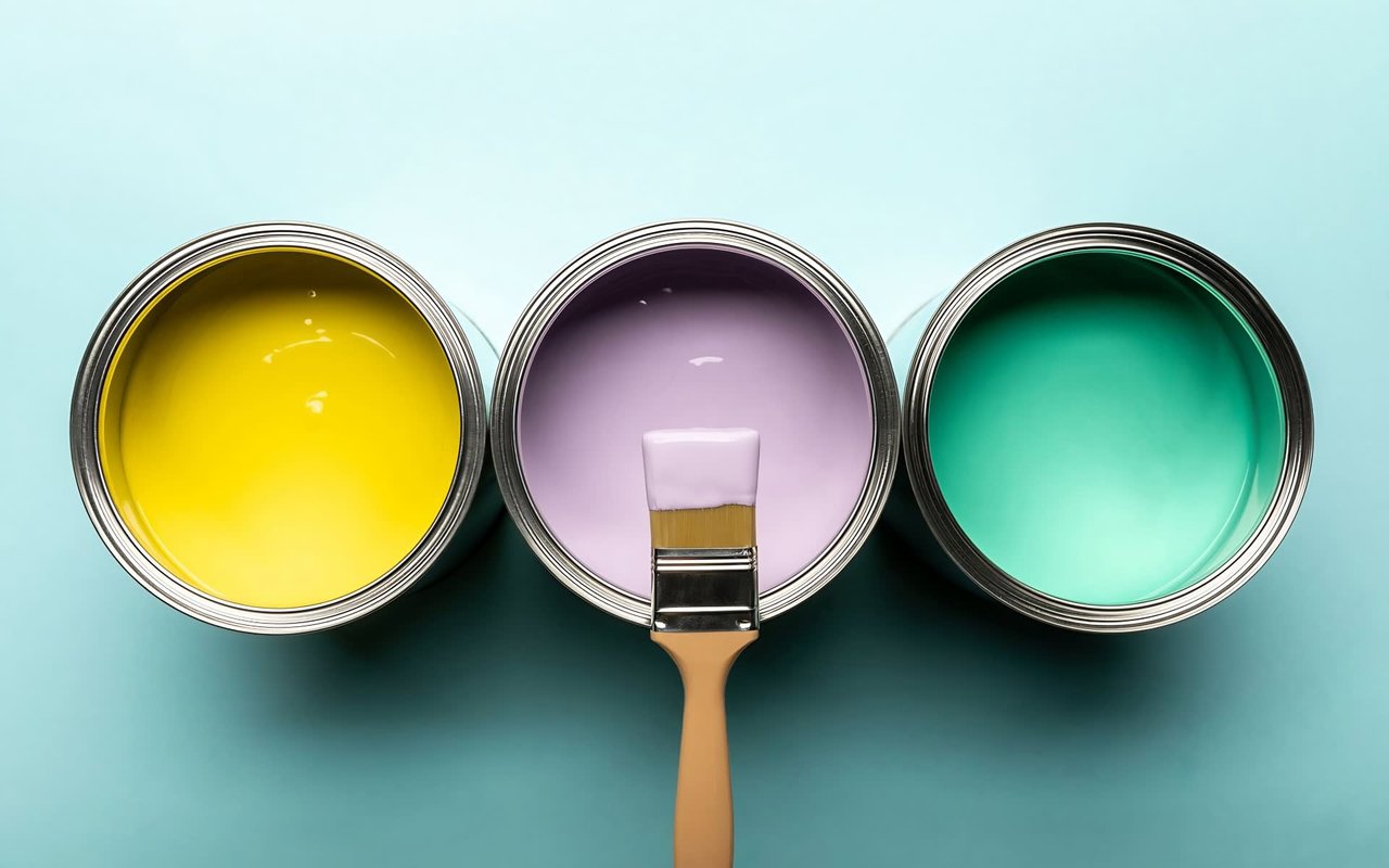
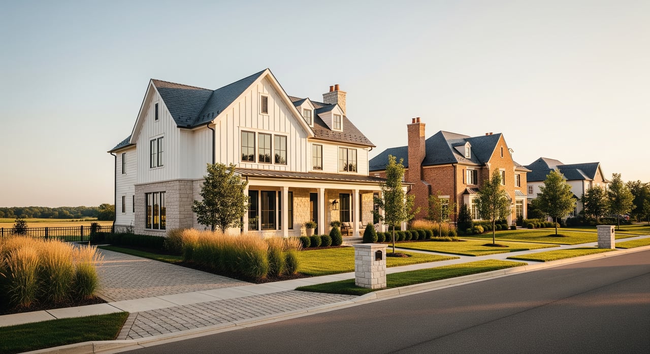
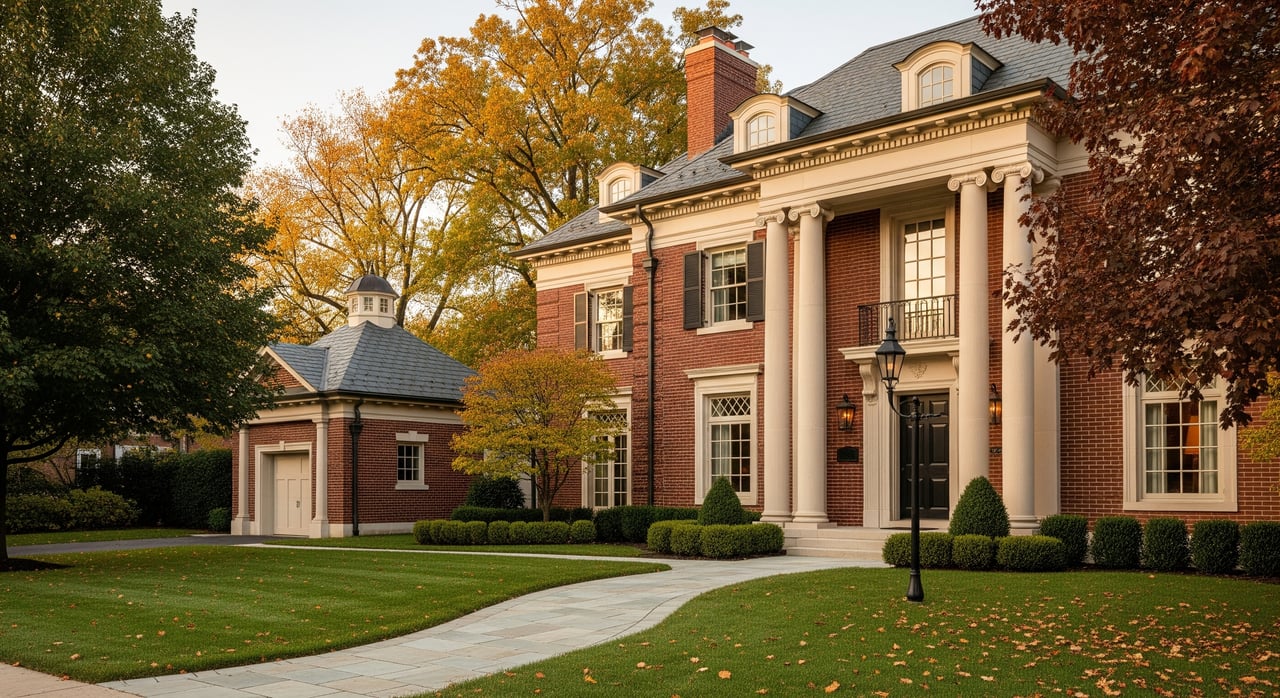
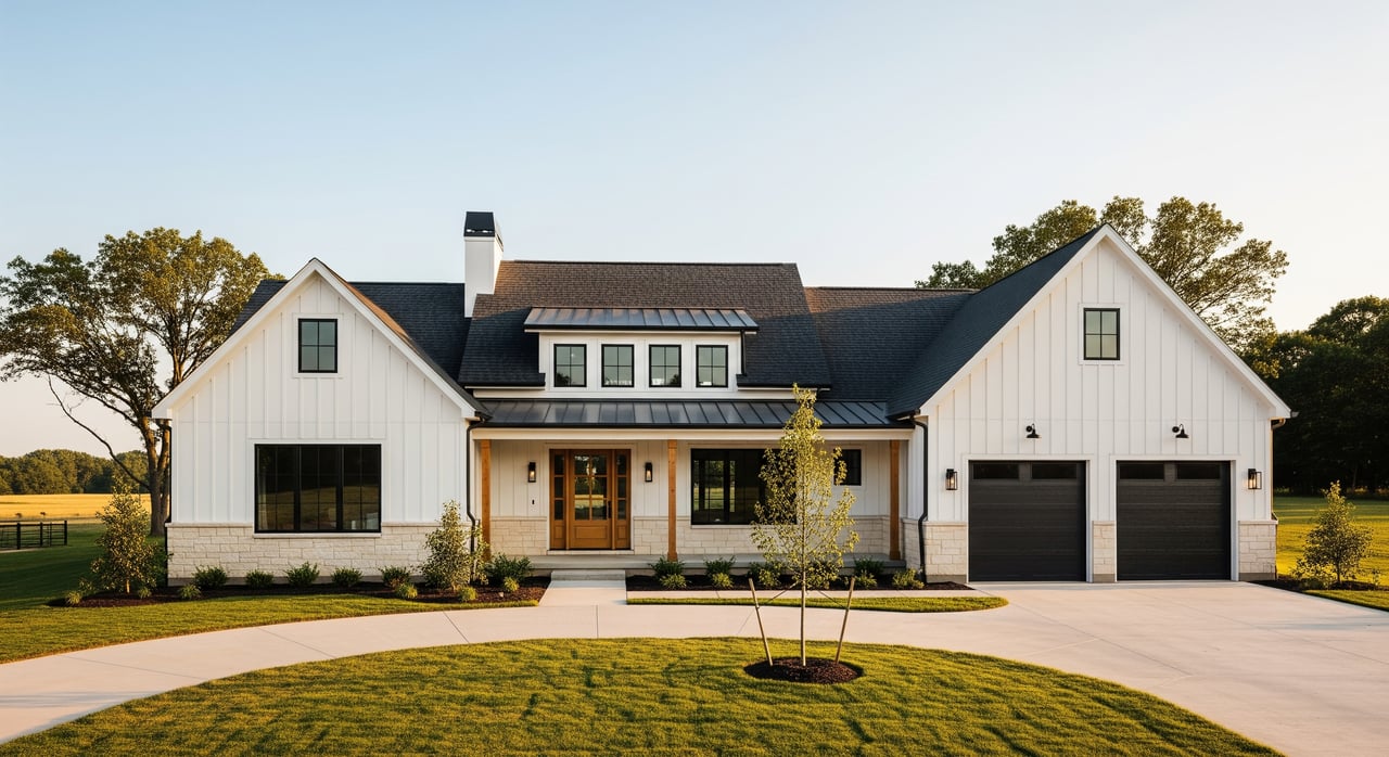
Struggling to figure out what color of paint to choose for your home? You aren’t alone. There’s a bewildering array of paint chips and sample cards available to examine at the local hardware store and everybody seems to have firm — but different — opinions about what hues look best.
Don’t worry: We’ve got you. Here’s our guide on the top three colors you should be using indoors and out on your home to liven up your look in 2020.
Finding Harmony Indoors
If you’ve been stuck inside for a while staring at your walls, you’ve probably come to realize that the “relocation beige” the former owner put on them before selling just doesn’t do anything to improve your mood. You want a color that makes your interior feel cozy and comfortable — somewhere you want to be, even when you don’t have to be there.
During volatile times, it’s only natural to gravitate toward colors that make you feel comfortable and serene. Here are the top three indoor trends:
1. Classic Blue, Navy and Other Nautical Shades
You may not realize it, but the right shade of blue can serve as an excellent “neutral” tone in your home, giving you a stylish backdrop for almost any decorating style — without having to resort to plain old beige or white.
Pantone named Classic Blue (19-4052) 2020’s “Color of the Year” and we see no reason to dispute the call. You can, however, play around a little with the exact shade of blue you prefer, so long as you stick to something that’s in the “true blue” part of the spectrum. To use blue as a neutral indoor color, you need to avoid shades that have any noticeable purple or green tones. In other words, cobalt or porcelain blue will look great on your walls, but a robin’s egg blue may start to look old really fast because of its underlying tinges of green.
2. Blush, Apricot, and Shade of Pale Rose
Do you want something brighter, lighter and cheerier than blue? If you still don’t want to resort to eggshell or some “barely-there” shade of off-white, you might want to check into the pale blushes, apricots and light rose tones that Consumer Reports indicates is popular right now.
These joyful tones are also starting to be embraced as a type of alternative neutral that can bring charm and sophistication to an indoor space without being overwhelming. Sherwin-Williams reports that Romance HGSW2067 has become a popular choice for dining rooms, bathrooms and bedrooms. If that’s a little too rosy for your liking, consider Benjamin Moore’s First Light 2102-70 instead.
3. Organic Grays and Muted Gray-Greens
Bright green can look overwhelming and harsh on interior walls, but muted tones of gray-green or an organic gray can both serve as great neutrals when paired with natural wood and stone. People like these shades because they are subdued and calming — something that a lot of people need when they’re retreating to their homes.
Interior designers say that you should skip the grass green or primary green shades and look for a shade like Fleur de Sel SW7666 that has complex undertones that will compliment your wood floors, shelves and trim or make the stone tile in your entranceway really pop.
Changing up the Mood of Your Home by Changing Its Exterior
White and gray are the two most highly recommended colors for the exterior of a home when trying to sell — but that’s mostly because they’re “blank slates” over which it’s easy to superimpose other visions.
If you’re going to be living in your home for a while, however, you may want to opt for a different color palette for your private palace. Designers say that you should generally avoid anything that’s too vibrant (like bright pink or purple) and aim for something subdued enough not to detract from your home’s or neighborhood’s natural beauty. Here are three popular choices homeowners are picking right now:
1. Basic Black or Charcoal Gray
Black has gone mainstream as an exterior home color and shows some staying power — but it’s definitely not for everyone. Before you decide on black for your home, you need to consider its architecture (and your neighbors) to make sure that it works well for your exterior. If you do commit, however, you may find that black elevates even a humble home into something surprisingly sophisticated.
If you can’t quite bring yourself to paint your home black, consider a charcoal gray like Behr’s Black Mocha PPU24-01 as an almost-there alternative that can be quite pleasing. Charcoal can hide a lot of “sins” in your wood or exterior design and put the accent on your landscaping instead.
2. Warm Brown and Coffee Tones
If black or gray seems a little too bold for your comfort, consider brown instead. Skip the taupe and tan shades and consider a rich, earthy color instead, like Behr’s Chocolate Coco Matte #S-G-760 paired with white trim to give your home a warm, inviting look.
Coffee tones, which can range from a dark espresso bean color to pale cafe-au-lait, can also be perfect. They’re also less limiting, especially if you favor yellow or red accents on your exterior.
3. Wine, Burgundy or Dark Red
If you want the exterior of your home to be bright, red may be an option. Red has always been a popular choice for trim since it can easily help spice up a more tepid neutral, but red is becoming increasingly embraced as a main exterior color — as long as it’s in the right shade. In other words, we’re definitely talking about something closer to “brick,” not “candy apple.”
Behr’s Sly Fox S-H-160 is a beautiful, bold choice that can make any home look welcoming, while Classic Burgundy HC-182 by Benjamin Moore is actually part of its historical collection, proving that the right shade of red does have enduring appeal.
Don’t be afraid to take your time — or take advice — when you’re making renovations. Just remember: The only person who truly has to be happy with your color choices is you.
